How we measure renewables: capacity, contribution and confusion

Reality Check is a quarterly series by energy analyst Allan O’Neil, offering a clear-eyed look at how Australia’s electricity system is really tracking – using fresh data, grounded analysis and Open Electricity’s system-wide tools.
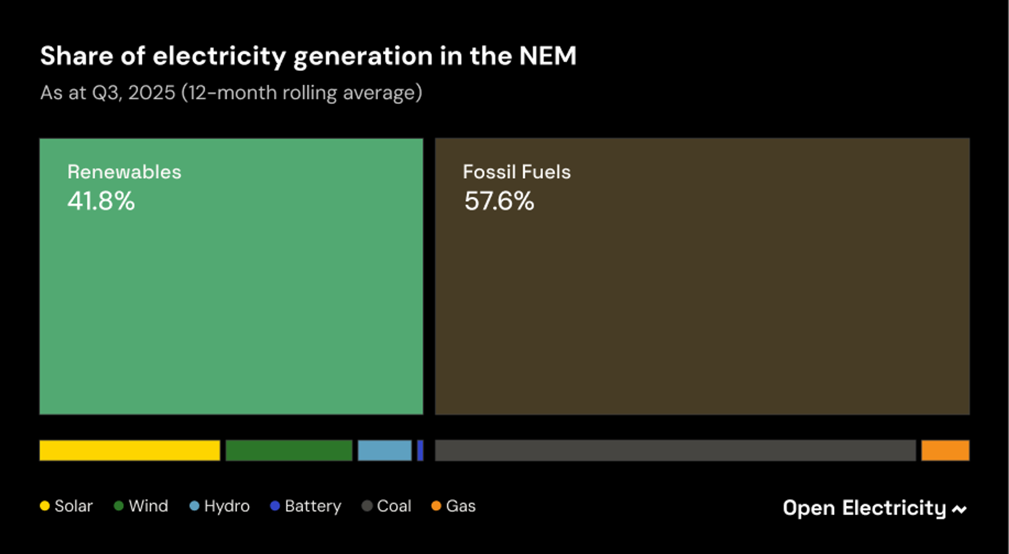
NEM Renewables: 41.8%, +0.7%▲ (Q2-Q3 change)
The third quarter typically sees a spate of new records in the NEM as winter gives way to sunnier, windier spring conditions. As well as absolute increases in peak and average outputs from technologies with growing capacity – wind, solar (both small and grid-scale), and currently the most rapidly growing of all, batteries – we almost inevitably see rises in renewables’ share of or contribution to the system.
There are many different ways we can measure this system share or contribution, and this quarter’s post discusses how these differ, what drives and limits them, and most importantly whether they’re useful and why or why not.
Capacity or Energy?
We can deal quickly with one measure of system share, based on nameplate or nominal capacity (maximum output, measured in MW or GW). Growth in capacity at technology level is a useful indicator of where and how fast investment is flowing. But comparing capacity levels or shares across technologies runs into the issue that energy production over time (GWh or TWh) by different technologies from a given amount of capacity (captured via “capacity factor”) can vary hugely for both technical and economic reasons, including the fact that they all have to work together as part of an interconnected system.
To illustrate, we could use OE’s Tracker to deduce that solar (large scale and rooftop) together with large scale batteries make up about 43% of the NEM’s installed capacity.
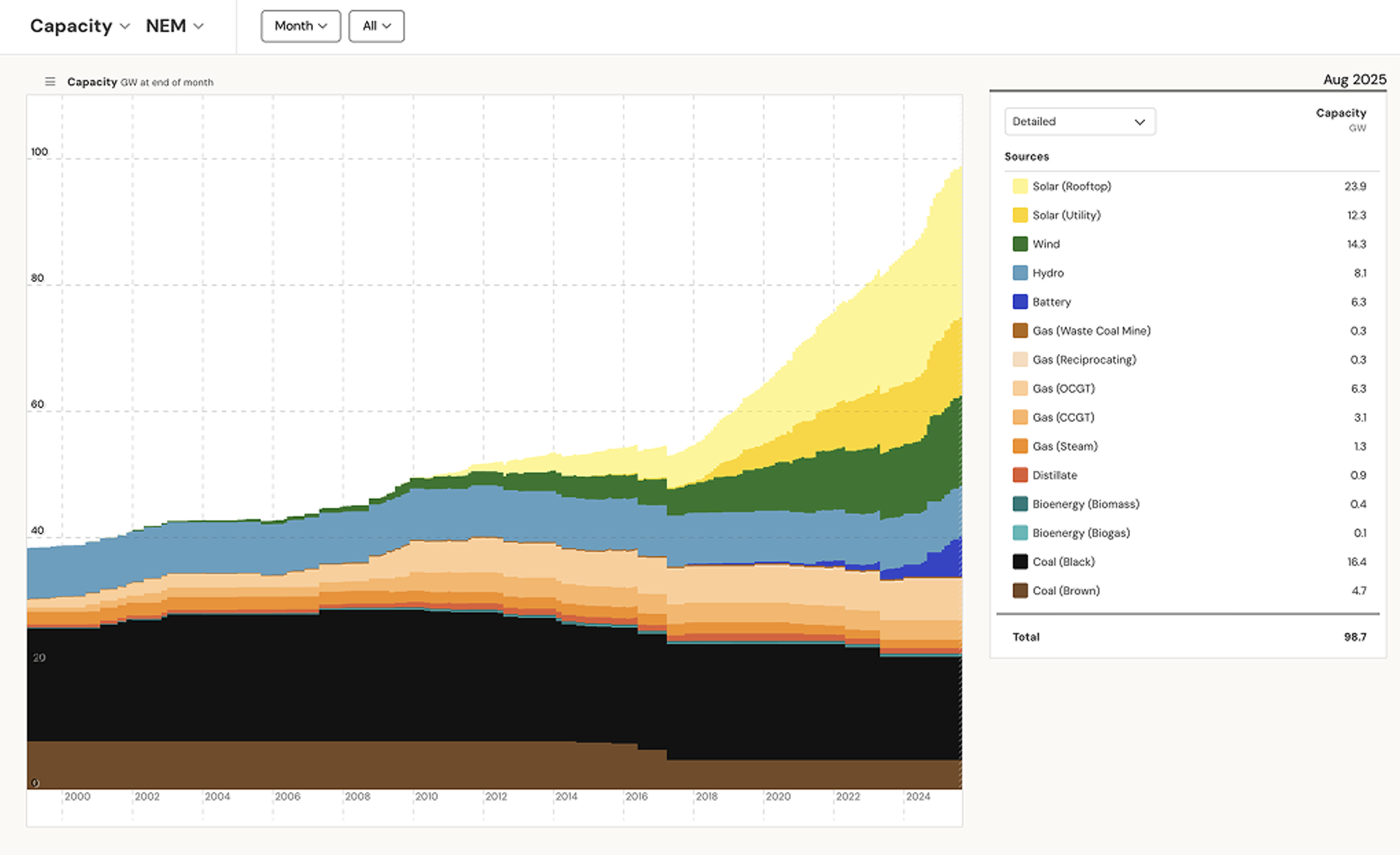
However solar provides a significantly lower share of the energy consumed in the NEM – about 21% in the last 12 months, while batteries time-shift energy rather than generate net supply. Conversely, with only 21% of the NEM’s installed capacity at the end of Q3, coal still provided 53% of total energy over the last 12 months.
In debate about the energy transition, barrackers for specific technologies or ideologies not infrequently misuse these capacity shares or their relationships to energy production via capacity factor. I think it’s more helpful to concentrate on measures that relate directly to society’s electrical energy needs and to things like emissions and emissions intensity, based on energy production shares.
Share of what – and where?
This may seem a redundant question: energy shares by technology should obviously come simply from dividing each technology’s production by total production, no? But there are wrinkles to this, since expressing contributions as a share of demand is a common approach too, and growing storage capacity means that production and demand don’t match precisely, particularly over shorter timeframes.
This also leads to a geographic angle: regions import and export between one another, so if we want to talk about regional energy shares, the difference between demand and production can be even more significant. If we’re interested in renewable energy shares and emissions, that leads to a further question about the ultimate source of any imports – do imports into South Australia from Victoria come from high-emissions brown coal, zero-emissions wind and solar, or some (what) mix? More broadly, how meaningful are regional shares in a large-scale power system interconnecting individual regions?
Tasmania illustrates the differences between some of these measures well, given its local generation base is almost entirely renewable: hydro and wind, with a small amount of rooftop solar. While it also has a bit under 400 MW of gas-fired generation, this is used sparingly, essentially to conserve water storage levels in extended dry spells. The island state is connected to Victoria by the Basslink cable, which can import up to 470 MW and export up to 590 MW, large values in the context of the state’s average demand which is around 1,100 MW.
Here's the makeup of Tasmanian supply including imports and exports over the last year:
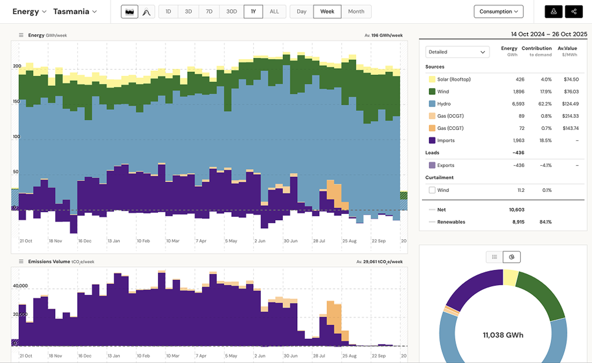
On a share of production basis, Tasmania’s generation over the last 12 months has been over 98% renewable, with gas providing less than 2% of energy produced. However Basslink has been heavily utilised this year to import energy from the mainland to help conserve water storage levels, with imports representing some 18% of the total energy either produced on or delivered to the island. If we calculate total Tasmanian renewable generation as proportion of on-island demand met from all sources, we get a significantly lower figure of 84%.
Arguably the “true” contribution of renewable energy to meeting Tasmanian demand lies somewhere between those two figures, since a proportion of the energy exported from Victoria across Basslink ultimately comes from renewable sources. But working out exactly how much can’t be pinned down precisely, being an arcane exercise which runs into issues including:
- the fact that Victoria might simultaneously be importing from its other neighbouring regions when exporting to Tasmania, or that
- the “marginal” Victorian generation required to meet Basslink exports at a particular point in time might be renewable output that would otherwise be spilled, but at other times wholly sourced from additional emissions-intensive brown coal.
The detailed bean-counting involved here wouldn’t add much overall insight – but it illustrates that measuring renewable energy contributions is not as straightforward as it might first seem. Again, there is scope for proponents of different views to cherry-pick methods and data that best fit their preconceptions.
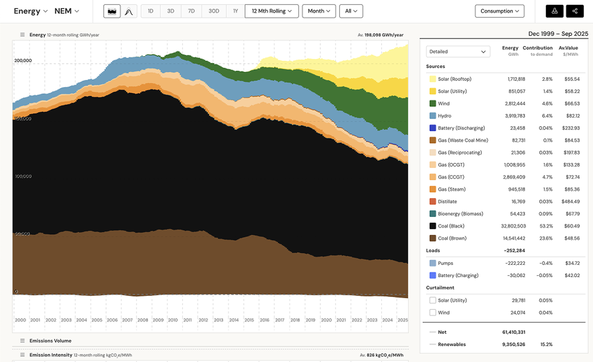
Getting back to the NEM as a whole, where imports and exports net out, these differences are much less material, and the 12 month share of production figure for renewables at 41.8% by the end of Q3 is a pretty robust number.
Over when?
Another dimension that is also important is whether we focus on “instantaneous” – in reality 5-minute or half-hourly - renewable shares, both high and low, or averages over extended time periods.
From an emissions perspective it’s the extended measures that are relevant. The atmosphere doesn’t care how rapidly greenhouse gases are emitted from hour to hour or day to day, it’s the total accumulation that counts.
But at the short end of the spectrum, “instantaneous” renewable contribution levels are very relevant to power system security and reliability in the transition towards a net zero emissions energy sector.
This distinction caused confusion when AEMO’s CEO first articulated an objective of having the east coast power system capable of operating securely with up to a 100% instantaneous renewable share. Some commentators seemed to misunderstand what “capable” means, and to totally miss the “instantaneous” part, going on to ascribe to AEMO some reckless and quite unachievable ambition of running a fully renewable power system by 2025.
In Q3 2025, the highest half-hourly renewable contribution to the NEM supply mix was 77.2% (as a share of production), up from a previous high of 75.6% in Q4 2024, and the prior Q3 high of 72.2%.
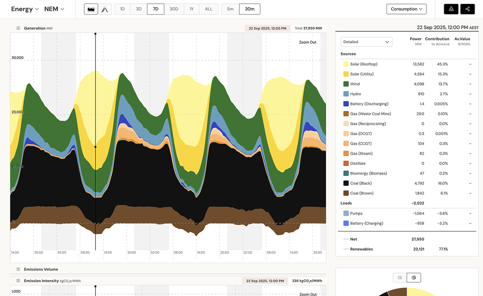
Since the end of Q3, a higher level of 78.6% has already been recorded. (Note that OE calculates contribution very slightly differently from AEMO, and I’ve used AEMO’s numbers here.)
There is already more than enough renewable capacity in the NEM to potentially meet 100% of total supply requirements over short time periods, when wind and sun conditions are favourable and demand is not too high. AEMO’s measure of “potential contribution” combines actual output from hydro and batteries with the energy available from wind and solar sources (but not all this available energy is necessarily used – the difference shows up as “curtailment” in the OE chart above). Note that this potential contribution measure doesn’t consider any transmission limitations on the amount of available renewable energy that could be dispatched or transferred between regions.
By this measure there were 32 half hourly instances of potential renewable contribution exceeding 100% in Q3 this year, and already 48 in October alone, with a maximum “renewable potential” reaching 113% of the supply actually needed at the time.
But if we considered what hydro and batteries could provide – their available capacity – rather than just their actual output, then we have already experienced many many more intervals which were potentially fully suppliable with renewables.
What limits?
The fact that we haven’t yet seen the NEM operating at 100% contribution reflects technical factors concerning system security (broadly, the power system’s robustness to disturbances), and to the output flexibility of different generating sources. In particular, coal-fired generators can’t reduce output below relatively high minimum generation levels (typically 40% - 60% of nameplate capacity) without resorting to uneconomic shutdowns or steam bypass strategies. They also continue to provide important electrical attributes like inertia, voltage control, system strength and fault current that until recently at least, have not been generally available from inverter-connected sources like batteries or renewable generation.
We have seen individual NEM regions – Tasmania and South Australia – operating at significantly higher renewable penetration levels though. In Tasmania’s case, hydro generation can provide all the required technical characteristics for system security, and for many years the island state has been capable of operation at 100% short term renewable contribution. In South Australia’s case, renewable contribution has reached over 98% of local generation on multiple occasions (and potential levels at times exceeding 200% of actual requirements!), but this has been enabled because its interconnection with the rest of the NEM bolsters system security against some forms of disturbance, as do recent investments in specialised network assets including synchronous condensers.
Where next?
For the moment, the limit on short-term renewable contribution for the NEM as a whole is largely dictated by the minimum output levels of the NEM coal fleet – this “thermal floor” puts a corresponding ceiling on renewable contribution tied to the overall level of operating coal capacity. Smallish increases in the reported numbers will continue to be made as growing battery storage capacity provides increases in effective demand at times of plentiful renewables, but it will only be on retirement of further coal units that we should expect to see larger step changes.
On the other hand the average energy share provided by renewables isn’t as tightly constrained in the near term, and will continue to provide a regular and clear indication of the energy transition’s rate of progress.
This article is available for republishing under a Creative Commons CC BY-ND 4.0 licence. Please credit the author and Open Electricity, include a link to the original. Edits allowed only with explicit permission from the author.