Slicing and dicing pricing

Reality Check is a quarterly series by energy analyst Allan O’Neil, offering a clear-eyed look at how Australia’s electricity system is really tracking – using fresh data, grounded analysis and Open Electricity’s system-wide tools.
NEM Renewables: 42.9%, +1.1%▲ (Q3-Q4 change)
Previous quarterly posts in this series dealt with the physical side of the NEM – generation volumes and trends, renewable energy shares and the like. These are the primary focus of Open Electricity’s visualisations, but also included in these views is information on wholesale prices, often discussed with some puzzlement and misunderstanding on social (and mainstream) media. This piece aims to unpack the financial side of the market just enough to reduce this confusion.
Discussion of electricity prices can rapidly descend into complexity: wholesale, retail, spot, forward, average, marginal, time-weighted, load-weighted, bid & offer, energy and FCAS, … a very long list with many small theses possible. Here I’ll discuss just the wholesale energy spot prices that apply to generation, loads, and demand dispatched through the NEM, and only scratch the surface sufficiently to explain some of what Open Electricity makes visible. I’ll provide links to further reading for those who want to dive deeper.
Spot prices and those mysterious “average values”
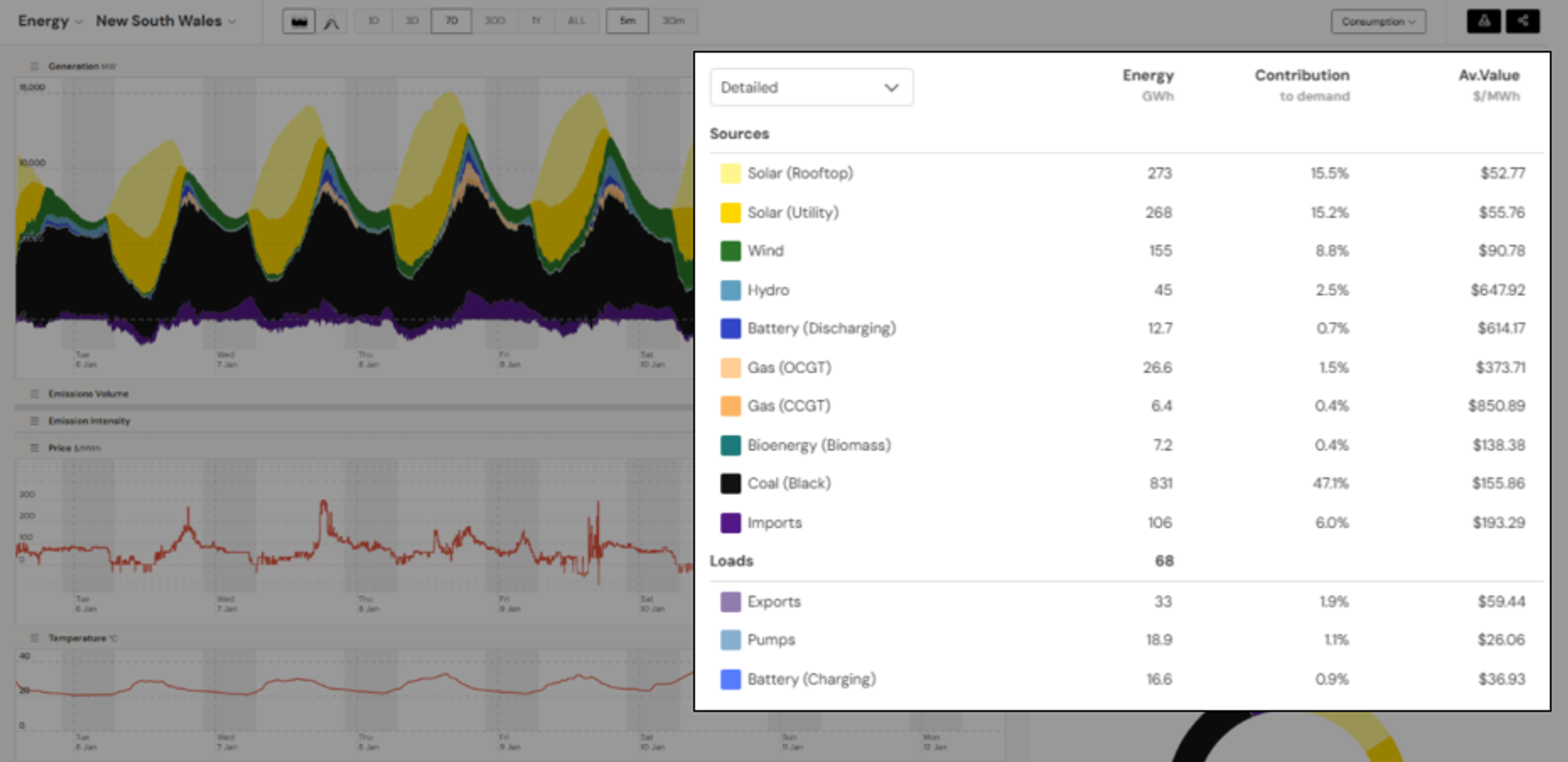
To begin, here’s an OE view of recent trends in New South Wales
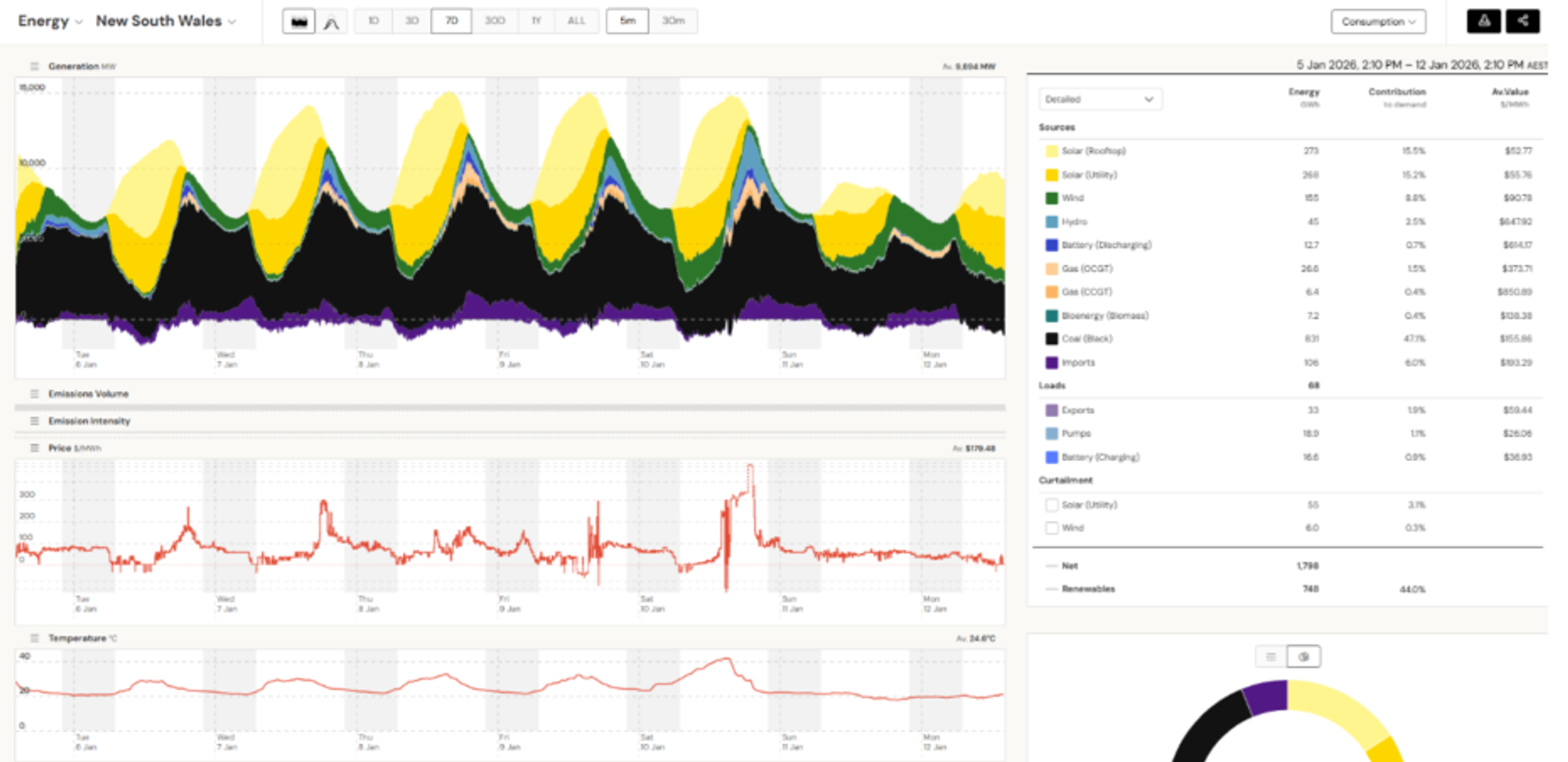
This shows prices in two places – a time series of 5-minute prices underneath the main generation mix chart, and a set of “average values” for each supply category in the summary panel at right.
Taking the 5-minute prices as given for now, how do they relate to the summary values for each supply category? There’s often confusion here but it’s really quite simple: the “average value” column is just a set of weighted averages of the 5-minute prices across the whole period shown, where the weights used for each supply source (or load, or interconnector import / export) are that source’s volume in each 5-minute period.
Sources with higher volumes in high-price periods like evening peaks (batteries discharging, gas-fired plants) will show higher “average values” than sources or loads whose volumes peak in low-price periods like the middle of the day (solar, batteries recharging). Sources whose output is less correlated with the 5-minute prices (wind, in this example) will sit somewhere in between.
If weighted averages seem obscure, another interpretation of these numbers is that they are the average price per megawatt-hour that each source would earn or pay over the period if its income or cost arose from selling or buying its variable volume every 5 minutes at each 5-minute price, adding up those individual periods and then dividing by total volume. But is that what actually happens in the electricity market?
Sort of. The NEM is a “mandatory spot market with gross settlement” in which all large-scale sources and loads are required to participate. They receive from, or pay to, market operator AEMO income and cost streams which are calculated at this 5-minute level. So for large-scale participants, weighted average spot prices are very relevant to actual income and costs.
But they’re far from the whole story, because outside the spot market there is a parallel electricity contract market – not run by AEMO – in which the same participants, as well as other parties like banks, can trade in financial hedging instruments which significantly alter – either increasing or decreasing – their overall income and cost streams.
This isn’t the place to delve into the complexities of contract trading and hedging: it’s enough to recognise that it creates a large overlay of financial transactions on top of the spot market cashflows summarised in the “average value” numbers. So those averages are at best a part of the puzzle, not the whole story.
What about customers?
How does this relate to small-scale suppliers and loads though? The Open Electricity view shows rooftop PV production and an “average value” for that – is this production also being traded in the spot market? And what about ordinary household and business customers – we’re not paying those 5-minute prices or their averages on our bills are we?
Yes and no. Small-scale players certainly don’t transact with AEMO like grid-level sources do. But on their behalf, electricity retailers do: retailers have to pay AEMO for the energy used by their customers, based on those 5-minute prices. Open Electricity can’t show each retailer’s load volumes and “average values” paid, because that’s confidential data and also extremely complicated to assemble – deriving ultimately from the metered usage of each retailer’s individual customers, run through a whole series of aggregating, shaping and netting processes.
What goes into individual customer bills is more remote again from spot market values. Like other wholesale market participants, retailers trade in financial contracts to hedge their purchases in the spot market, and bills also include a whole raft of downstream costs for distribution, transmission and other things, which for small customers don’t get broken out individually, nor even separated from the retailer’s wholesale energy costs. All that most end users see is a rolled-up tariff structure with usage and fixed charges that combine all the costs (and profits) that retailers seek to recover.
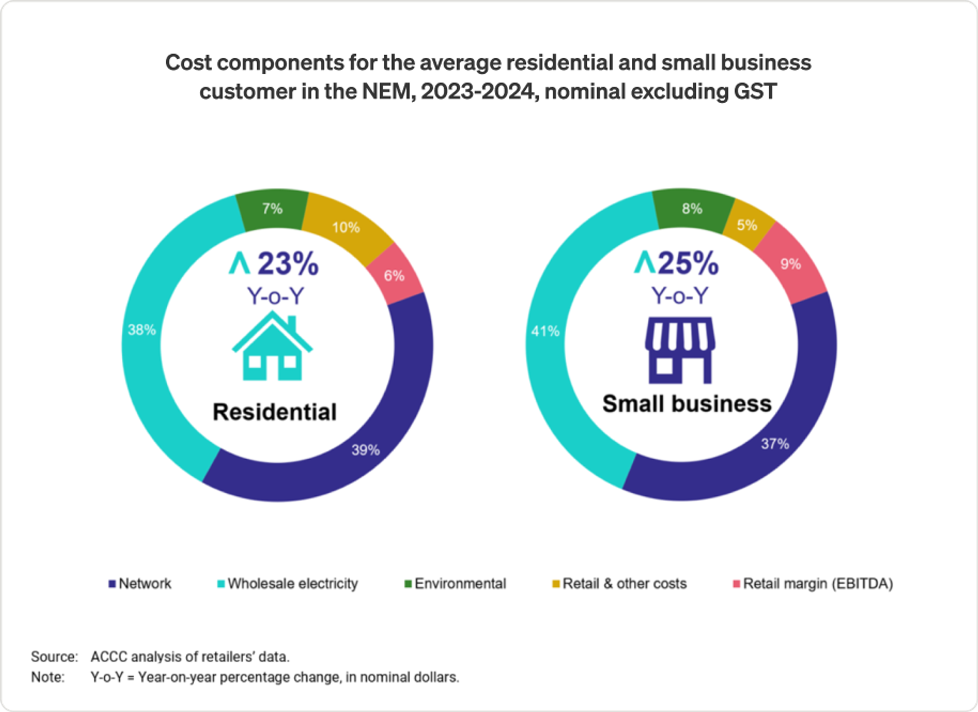
Analysis by bodies like the ACCC and AER does examine the set of input costs underlying retail bills, producing breakdowns like the one shown below, where wholesale energy costs are only around 40% of typical smaller customer bills.
What about PV
For small-scale rooftop PV, retailers – who buy consumers’ exported solar at their offered feed-in rates – effectively get a credit from AEMO valued at 5-minute spot prices, as though those retailers were on-selling that fed-in energy into the spot market (equivalent to reducing the retailer’s spot market energy purchases from AEMO). But the OE chart shows an estimate of total rooftop PV output, including consumer’s self-consumption, not just the portion of it fed back into the network and credited to the retailer. So the “average value” for total rooftop PV production is very much a notional calculation of what it would be worth in the spot market – not what anyone is actually paying for or earning from it.
Summing up the averages
For small-scale rooftop PV, retailers – who buy consumers’ exported solar at their None of the above means that wholesale spot prices are irrelevant to end users – over time, prices of the financial contracts used by retailers tend to reflect spot price levels and expectations, so even after contracting, the wholesale cost portion built into customers’ tariffs will broadly follow trends in the spot market, but often with long lags – retail electricity prices today are still feeling the effects of the dramatic runup in spot prices over 2022 – triggered by the global surge in energy prices following Russia’s invasion of Ukraine.
To end this section, a couple of things that the average values are definitely not:
- The production cost of electricity from each source type – this may be very different from spot market average value.
- What individual generators earn – as well as the effect of contracts, each generator’s volume profile will vary, so its individual average value could be quite different from the category as a whole.
What customers pay – as just explained, retailers’ contracting activities and a whole set of downstream costs end up being part of end users’ bills. The wholesale energy component is generally well under 50% of the bill.
On the spot
But back to the 5-minute spot prices themselves – where do they come from?
In summary, they are an output of the same process that determines which generators and loads are “dispatched” every five minutes, and the volumes they are instructed to produce in order to balance grid demand.
It’s easy to get very technical about electricity markets and the NEM, making them seem unique and completely artificial. Although they are specialised, the concept underlying these markets is nothing more than the “Economics 101 model” of supply, demand and price for a uniform commodity traded in an open market:
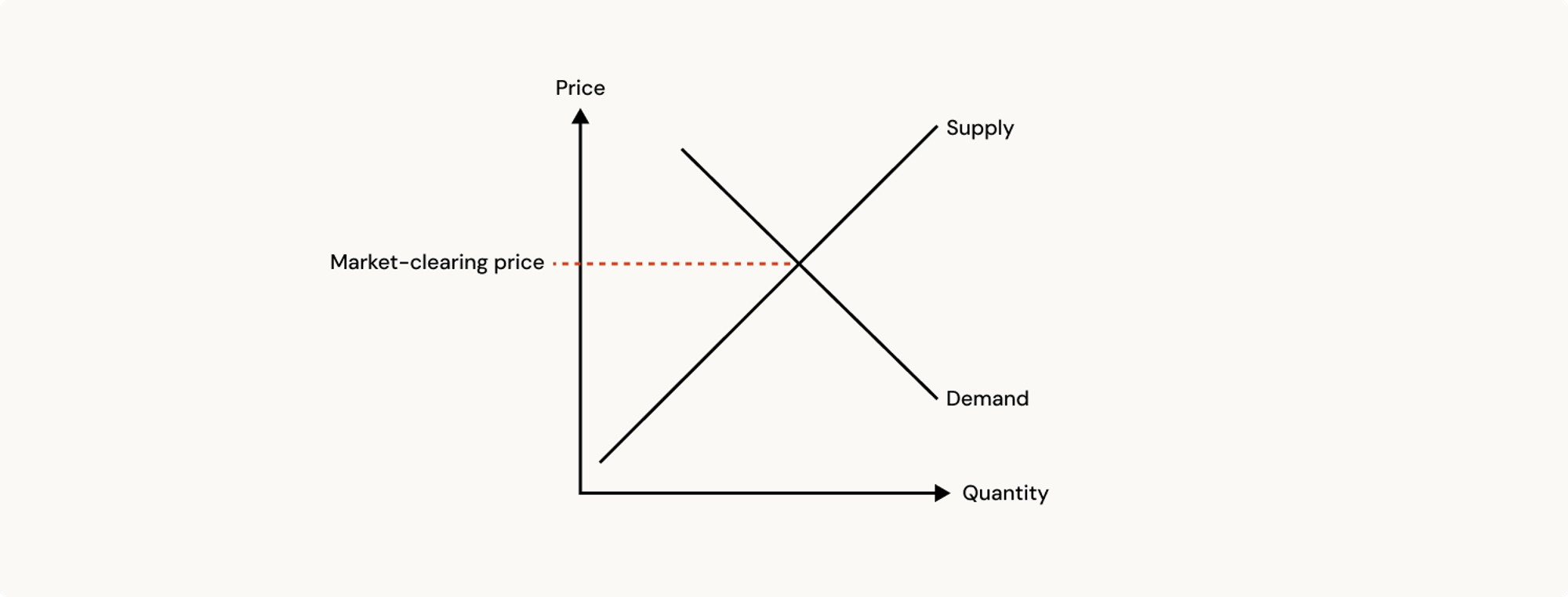
Read from the vertical price axis to the horizontal quantity axis, the supply curve says that at higher market prices suppliers will be willing to sell larger quantities – or that there will be more suppliers willing to sell the quantities they have available. The demand curve shows the converse – at higher prices fewer buyers will pay up and the total quantity demanded will be lower. The market-clearing price and quantity are the point where preparedness to sell and willingness to buy match.
A key feature of the model is that there is a single, common clearing price at which the commodity is bought and sold. The total quantity from suppliers willing to sell at or below that price matches the quantity sought by buyers prepared to pay at least that price for the commodity. While some sellers would accept less, there is no reason for them to sell below P when there are enough buyers willing to pay at least that much. Buyers prepared to pay more than P have no need to, since the quantity they want – individually and collectively - is available at that price. So we end up with a single price.
NEM 101
There’s no requirement for supply and demand curves to be smooth straight lines with any particular slope – any of the variants below convey the same idea and could represent the market for a specific commodity:
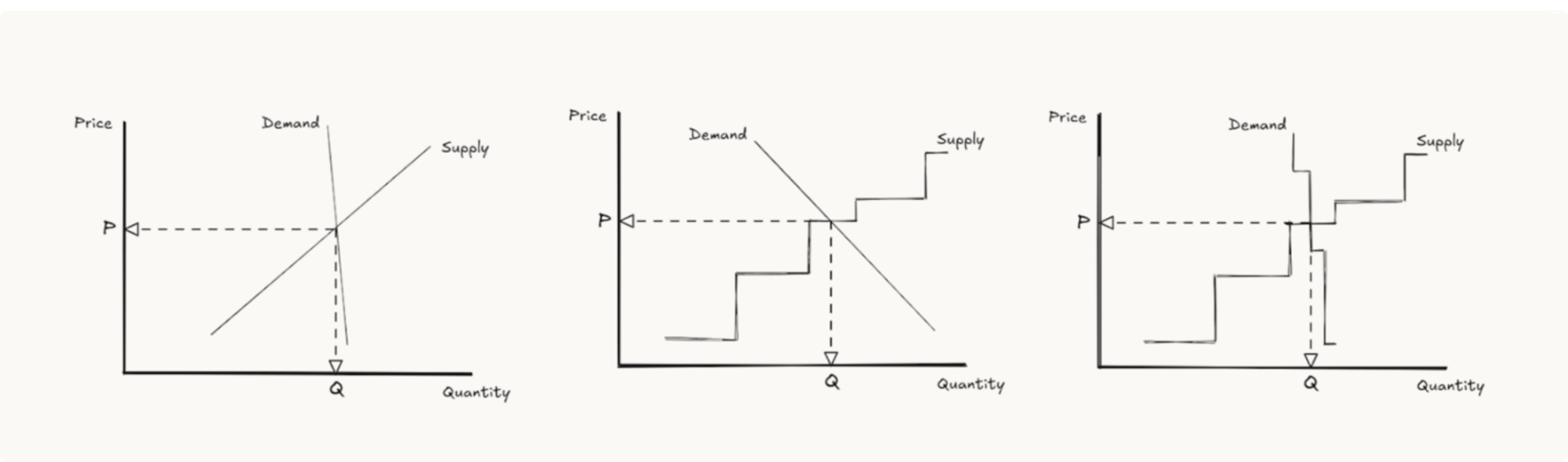
The third chart looks most like the NEM’s 5-minute electricity spot market. The supply curve comprises offers to generate quantities of power, arranged in increasing price order. The demand curve is close to vertical because in real time relatively few users will adjust their consumption in response to the wholesale spot price. The clearing point determines both:
- which generators are instructed to generate (and loadings for price-responsive loads in the demand curve, like grid-scale batteries), and
- the wholesale spot price applying to all electricity produced and consumed in this pricing interval
Both concepts are carried over directly from the economics of other commodity markets.
When first introduced to the spot electricity market, many think it unusual or even plain wrong that the highest-priced generation offer accepted (the point on the supply curve where it matches demand) determines the spot price paid for all energy in a pricing interval – if there are sellers offering to generate at a lower price, why aren’t they only paid that? But paying a common clearing price is no different to what happens in most markets for homogeneous commodities. [L Hirth ref]
Just as pertinently, if sellers were only paid their individual offer prices to generate (a “pay as bid” market), not the common clearing price, most would increase their offer prices significantly. The common clearing price strongly encourages sellers to offer at prices below their competitors, if they can, to ensure their volumes get sold, while knowing that they will be paid the market-wide price.
What is specialized about the NEM is that the clearing of supply and demand happens every five minutes, with the supply and demand curves varying or shifting as both demand levels and supply availability vary across time. This can make electricity prices quite volatile, and the data underlying the market very voluminous indeed.
This is one reason why the “average values” in Open Electricity’s visualisations are valuable – they summarise a lot of information about price and volume dynamics in a compact set of numbers.
Summing up the spot price
To emphasise this, and provide some long-term market-wide context, here’s a view of weighted average spot prices for the NEM and each of its 5 regions going back to 1999, weighted by grid demand (essentially the aggregate volume of all large-scale supply sources), and shown as rolling 12-month averages. Think of these numbers as annual “average value” prices for the grid as a whole. Overlaid are a few notable market events.
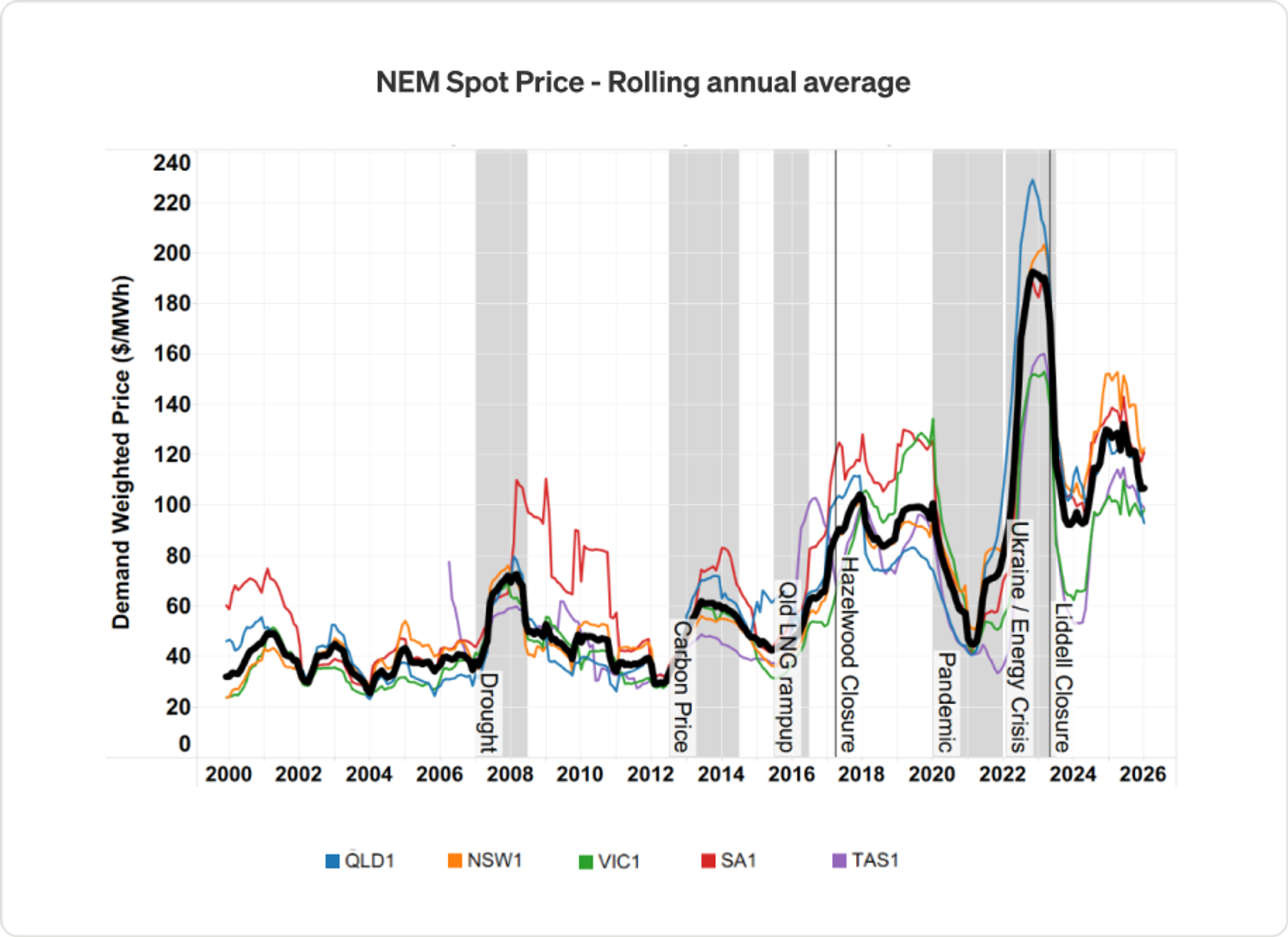
Far more space would be necessary to fully unpick the price trends and drivers shown here, but two broad phases are evident. These phases are separated by the pivotal events in 2015-2017 of Australia’s east coast gas market becoming connected to world energy prices after commencement of large-scale LNG exports from Queensland, and closures of larger-scale legacy power plants beginning. Since then NEM average prices have become more volatile and far more influenced by global factors than over the two preceding decades. The transition to renewable energy sources holds out promise of at least partially decoupling NEM prices from these global factors, but we’re certainly not there yet.
This article is available for republishing under a Creative Commons CC BY-ND 4.0 licence. Please credit the author and Open Electricity, include a link to the original. Edits allowed only with explicit permission from the author.